

Most people who say they want more colour in their home also say they are afraid of getting it wrong. The fear is understandable. A colour decision made boldly and badly is harder to live with than a neutral that never quite excited anyone. But the homes and spaces that people find most memorable, the ones they describe with genuine enthusiasm and return to in their imagination, are almost never the neutral ones. They are the ones where someone made a genuine colour decision and followed it through with commitment.
Here is how to use colour with confidence, from the gentlest pastels to the most daring contrasts.
One of the most sophisticated approaches to colour in an interior is to treat it not as a single decision applied consistently throughout but as a series of deliberate shifts that create a spatial journey. A space that moves from bright and energising at the entrance to softer and more intimate in the private rooms gives visitors and occupants a sequence of experiences that feels curated rather than accidental.
An entrance or public-facing space can carry more colour energy than a bedroom or a study. The front of the home, the areas where first impressions are made and where social energy is highest, can absorb bolder colour decisions than the private retreats at the back. Working with this gradient of colour intensity from public to private creates a home that feels dynamic without feeling overwhelming in any single space.
The practical application is to plan your colour scheme as a sequence rather than a single decision. What is the first colour experience when you enter? How does it shift as you move through the living spaces? How does it resolve in the most private rooms? Answering these questions in sequence produces a more interesting and more coherent colour strategy than choosing a palette for each room independently.
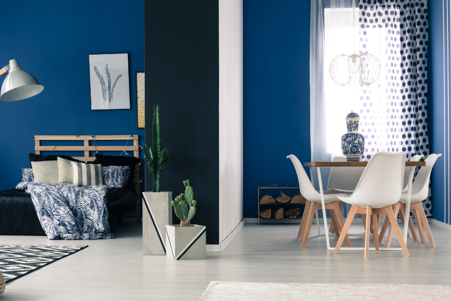
For anyone new to using colour in interiors, pastels are the most forgiving starting point. Soft blush, dusty sage, pale lavender, and warm cream carry colour temperature and mood without the visual commitment of a fully saturated tone. They suit a wide range of furniture and material combinations and can be layered against each other without clashing.
The transition from a pastel palette to a bolder one within the same home is one of the most interesting colour moves available. A living room in soft, warm pastels that gives way to a study or library in a deep, saturated version of the same colour family creates a spatial shift that makes both rooms more interesting by comparison. The pastel room feels airy and serene in contrast to the depth of the bold room. The bold room feels rich and enveloping in contrast to the lightness of the pastel one.
This gradient approach to colour, using lighter versions in the more open, social spaces and deeper versions in the more enclosed, private ones, suits the way most Australian homes are used and the quality of light in most Australian interiors. Dulux has a strong range of colour families that move coherently from pale to saturated, which makes this kind of gradient planning more accessible than choosing colours independently.
The most striking interiors often work through deliberate contrast rather than harmony. Two materials that are opposites in texture, finish, or visual weight placed in direct relationship with each other. A plush velvet surface against a raw brick wall. A glossy subway tile against an exposed timber beam. An ornate painted ceiling above a minimal mirrored surface. A candy pink upholstered sofa beside a strong black leather piece.
These contrasts work because each element is chosen with full awareness of what it will sit beside. The contrast is not accidental but deliberate, and the result is a visual tension that makes both elements more interesting than they would be in a more harmonious composition.
The discipline in using contrast this way is ensuring that each element in the contrasting pair is strong enough individually to sustain the comparison. A weak or tentative element paired with a strong one does not create productive tension. It creates a composition where one element dominates and the other disappears. Both elements need to be chosen with genuine commitment for the contrast to work.
One of the most commonly misunderstood aspects of bold colour design is the mixing of prints and patterns. The fear is that multiple patterns in the same space will create visual chaos. In practice, multiple patterns coexist beautifully when they share a consistent colour thread that runs through all of them.
A floral print upholstery in pink and green, a geometric cushion in the same pink with a different green, and a stripe in a lighter version of both colours are three different patterns that belong to the same colour conversation. The eye moves between them following the colour thread rather than being confused by the variety of pattern types.
The print and pattern article published separately on this site covers this principle in detail, including the rule about choosing one dominant pattern and letting the others support it. In a boldly coloured interior, the dominant pattern is usually the one with the most surface area, typically the upholstery or the wallpaper, and the supporting patterns appear in cushions, rugs, and accessories.
In a home where the architecture is relatively neutral, the most effective and reversible way to introduce significant colour is through upholstery and soft furnishings. A sofa in a deep jewel tone. Dining chairs in a warm, saturated fabric. Curtains in a bold print. Cushions in a mix of complementary colours and patterns. These choices introduce colour at the scale of the furniture, which is the dominant visual experience in most rooms, without requiring any structural or painted change.
The advantage of using soft furnishings as the primary colour vehicle is flexibility. Cushions can be changed seasonally. A sofa can be reupholstered rather than replaced. Curtains can be rehung in a different room if the palette changes. This flexibility makes bold colour through soft furnishings a lower-risk proposition than painted walls or coloured tiles, while delivering an equivalent visual impact.
Warwick Fabrics offers an extensive range of upholstery fabrics in a wide spectrum of colours and patterns suited to both residential and commercial applications, and is worth exploring when planning a bold upholstery project.
The most visually interesting colour moments in an interior are often not the large painted surfaces or the upholstered furniture but the individual objects that introduce colour in a concentrated, specific way. A painted piece of furniture in an unexpected colour. An embroidered or appliquéd textile with a complex colour palette. A ceramic sculpture in a bold glaze. A framed decorative plate with a graphic, colourful pattern. A mobile or hanging object that catches light and distributes colour through the room.
These one-off or artisan objects bring colour in a way that feels personal and curated rather than commercially applied. They also introduce a quality of handmade character that manufactured objects cannot replicate, and they create conversation points that a uniformly coloured room does not.
The Print Emporium is a useful starting point for colourful art prints that can introduce a specific colour moment into a room at a modest investment. For ceramic and artisan objects, Melbourne's design markets and artisan studios offer a range of one-off pieces that bring the same quality of concentrated colour character.
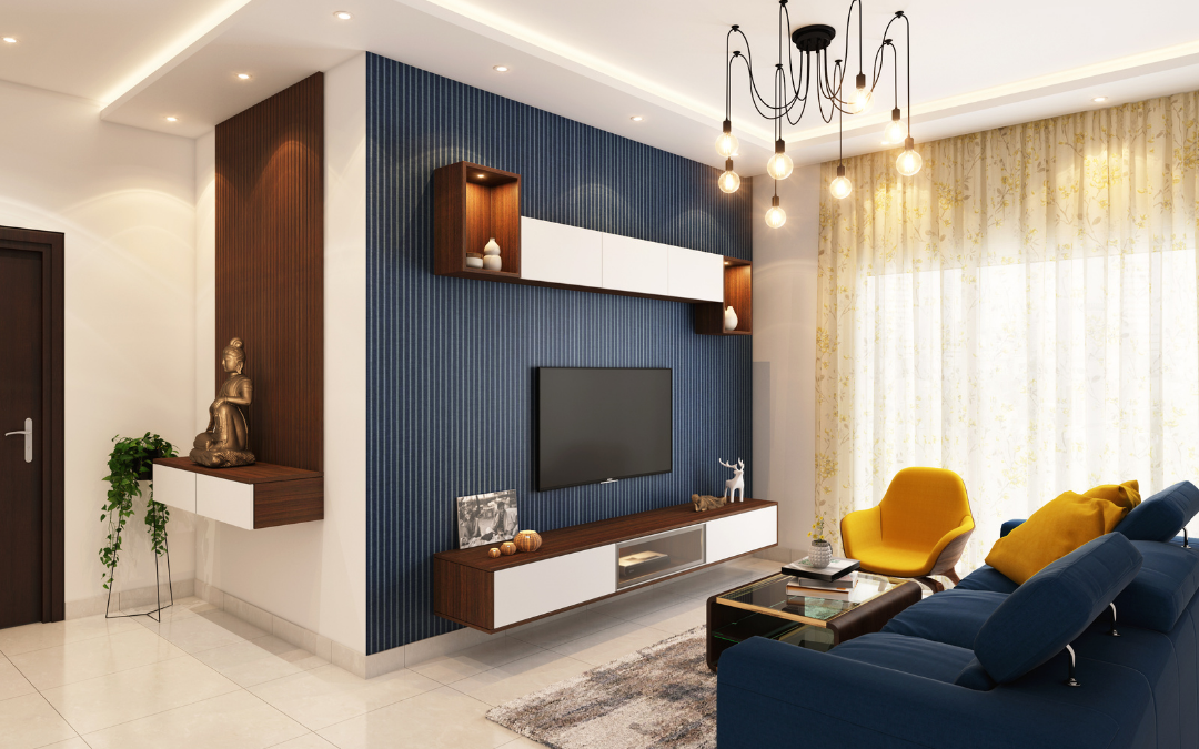
There are two fundamentally different approaches to colour in a designed interior, and understanding the distinction helps clarify which approach is right for a specific space and a specific sensibility.
The cohesive colour space uses a carefully selected palette of related tones applied consistently across surfaces, upholstery, and accessories. Every element shares a colour relationship, and the result is a room that feels harmonious, settled, and complete. This approach rewards careful palette planning and suits spaces designed primarily for rest and visual calm.
The contrasting colour space deliberately places opposing colours, tones, and material qualities in direct relationship, using the tension between them to create energy and visual interest. This approach rewards commitment and confidence, and suits spaces designed for social energy, creativity, and the kind of visual surprise that makes a room memorable.
Neither approach is superior. Both require genuine design thinking and genuine commitment to work well. The most interesting interiors often use elements of both, applying cohesion in the private spaces and contrast in the social ones, which returns us to the colour journey principle with which we began.
A home that uses colour with genuine confidence, that moves through a range of tones from light to deep, that mixes prints and patterns around a consistent thread, that uses contrast deliberately and artisan objects as concentrated colour moments, is a home that people remember and that its occupants genuinely love living in.
The fear of getting it wrong is real but it is also manageable. Start with soft furnishings that can be changed. Test colours in the actual light of your room before committing. Build the palette from one piece you love and let everything else respond to it. And give yourself permission to be surprised by what works.
If you would like help developing a colour strategy for your home, get in touch. Colour is one of the most enjoyable parts of any design project and we would love to help you use it well.


