

The most interesting homes are rarely the ones that followed a single style perfectly from start to finish. They are the ones where someone made a series of genuinely considered decisions, some expected, some surprising, and the result feels entirely their own. These are the kinds of decisions that are worth studying not to copy, but to understand the principle behind them and apply it in your own context.
Here are seven design decisions we find genuinely inspiring and the thinking behind why each one works.

When a space has strong existing character, whether industrial bones, warehouse proportions, or a period building with original details, the instinct is often to lean into that character and match the interior to it. But some of the most striking interiors do exactly the opposite. A soft, European-inspired interior inside a raw industrial shell. Delicate crown moulding and lacquered cabinetry inside a former factory. French provincial furniture in a converted warehouse.
The contrast between the bones of the building and the interior within it creates a visual tension that makes both elements more interesting than they would be separately. The industrial space emphasises the softness of the interior. The refined interior emphasises the rawness of the shell. If your home has strong architectural character that you have been trying to work with, consider whether working against it might produce something more surprising and more personal.
The kitchen is the room most people treat as a practical decision. Cabinetry colour, benchtop material, appliance specification. These are important choices, but they are often made conservatively out of concern for resale value or a desire not to overcommit.
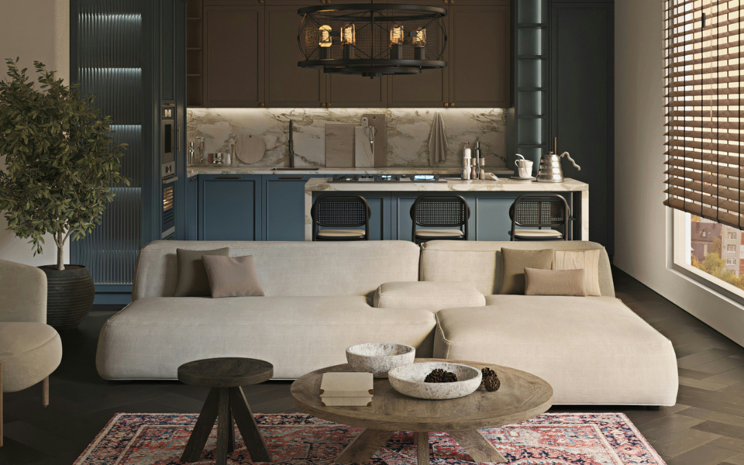
Some of the most memorable kitchens are the ones where someone committed fully to a single bold decision and built everything else around it. Floor-to-ceiling cabinetry in a deep lacquered colour, Aegean blue, forest green, or midnight navy, with brass or unlacquered copper hardware, creates a kitchen that is immediately distinct and immediately personal. Paired with a quality stone benchtop and considered lighting, this kind of commitment produces a room that feels designed rather than selected from a catalogue.
The fear is that a bold kitchen colour will date quickly. In practice, a deeply committed, well-executed colour choice in quality materials tends to age far better than the safe neutral that was never quite right in the first place. Dulux has a strong range of deep, saturated tones suited to cabinetry applications that are worth exploring before defaulting to white.
A room that is entirely neutral can feel calm and considered, or it can feel unresolved and slightly unfinished. The difference is often a single bold colour moment that gives the neutrality something to rest against.
A cobalt blue fireplace surround in an otherwise white and timber room. A deep terracotta feature wall behind a bed dressed in white linen. A single emerald green velvet armchair in a room of warm neutrals. These moments do not need to be large to be effective. In fact, the smaller and more precise the colour moment, the more it tends to read as deliberate rather than decorative.
The principle is that one strong colour decision gives a room a centre of gravity. Everything else in the room organises itself around that decision, which paradoxically makes the neutral elements feel more considered rather than less.
Rooms furnished entirely from one era or one design period can feel like a showroom or a museum rather than a home. The most liveable and most interesting interiors mix pieces from different periods, a 1940s chandelier above a contemporary dining table, a Victorian armchair reupholstered in a modern fabric, a mid-century sideboard alongside a contemporary sofa.
The key to making this work is having a consistent thread that connects the pieces despite their different origins. That thread might be a colour palette, a material family, a consistent quality of craftsmanship, or a shared mood or character. The pieces do not need to match. They need to belong to the same conversation.
When sourcing furniture, the combination of vintage and contemporary almost always produces a more interesting result than either alone. A single well-chosen vintage piece adds the layer of history and authenticity that new furniture cannot replicate, and it gives a room the feeling of having been accumulated over time rather than purchased in an afternoon.

Open plan living has been the dominant residential layout for decades, and it has genuine advantages in terms of light, flow, and connection between spaces. But it also has real limitations, particularly in homes where different activities need to coexist. A child doing homework while dinner is being cooked while someone is on a work call in the same space is not a comfortable arrangement for anyone.
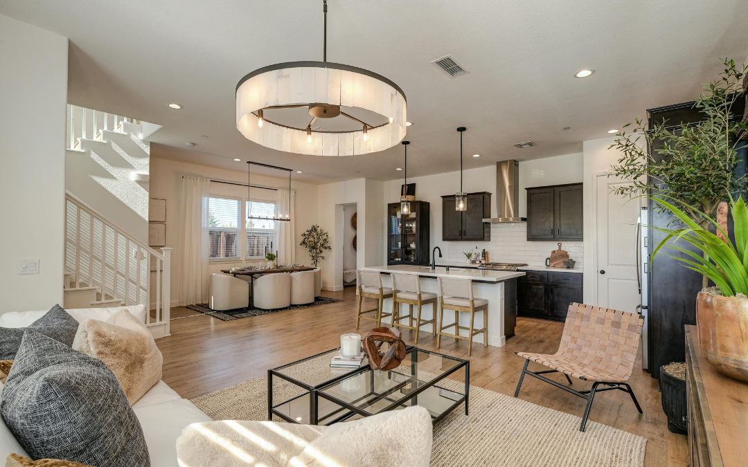
Some of the most considered recent renovations have moved deliberately away from fully open plan toward more defined zones. Not necessarily with full walls, but with deliberate spatial boundaries, a half wall, a change in ceiling height, a shift in flooring material, a run of cabinetry used as a room divider. These boundaries allow different activities to happen simultaneously without competing, and they give each zone a sense of purpose and enclosure that an undifferentiated open space cannot provide.
If your open plan home feels chaotic or difficult to settle in, the solution may not be more styling. It may be a more considered approach to zoning within the existing footprint.
Children's bedrooms are often the rooms in a home where the most creative decisions are made, and also the rooms where those decisions are most quickly reversed as tastes change. The most enduring approach is to build in one genuinely imaginative element that grows with the child rather than dating quickly.
A starry-night ceiling treatment that works for a five-year-old and still feels magical at twelve. A reading nook built into a bookshelf with a curtain that can be drawn. A loft bed with a slide that becomes a desk platform when the child outgrows the slide. These decisions require more thought than a themed wallpaper and a matching bedspread, but they produce spaces that children genuinely inhabit and love rather than simply sleep in.
The children's bedroom article published separately on this site explores this idea in more depth, including how to plan storage and display systems that adapt as children grow.
One of the most delightful design decisions available in a home is concealing something surprising behind something ordinary. A home cinema behind a bookshelf that pivots. A bar concealed behind cabinet doors that read as part of the joinery. A study hidden behind a panel that looks like a wall. A wine cellar accessed through what appears to be a kitchen cupboard.
These concealed spaces serve a practical function, they keep the main living areas calm and uncluttered, but they also create a sense of discovery and delight that makes a home feel more interesting to inhabit. The element of surprise is a genuine design tool, and using it well requires thinking not just about what a space contains but about how it is revealed.
Even in smaller homes this principle has applications. A desk that folds into a wall. A bar cart that lives in a cupboard and comes out for entertaining. A collection of art stored in a custom-built rack that slides out from behind a panel. The principle scales to any size of home and any budget.

What all of these ideas share is that they required someone to make a deliberate choice rather than a default one. To go bold with the kitchen colour when white would have been safer. To mix a 1940s chandelier with a contemporary table when matching would have been easier. To close off the open plan when convention said to open it up.
The homes and spaces that people remember and return to are almost always the products of decisions made with genuine thought and genuine commitment. They are not the result of following a formula or playing it safe.
If any of these ideas have sparked something for your own home, get in touch. We would love to help you think through how to apply them in your own space.


