Pattern and print are two of the most powerful tools in interior design, and also two of the most avoided. Most people play it safe with neutrals and plains, not because they do not love pattern, but because they are not sure how to use it without the room feeling chaotic. The good news is that there are a few clear principles that make the difference between a room that feels confidently layered and one that feels busy and unresolved.
Here are five practical tips for using print and pattern in your home with confidence.
The first step to using pattern more confidently is expanding your idea of where fabric belongs. Most people think of patterned fabric in terms of upholstery, cushions, and curtains. But a beautiful textile can also function as wall art, a room divider, a table runner, or a decorative throw that introduces pattern without committing to a full reupholstery project.
A length of luxurious patterned linen, cut to a rectangle and professionally framed, becomes a textile artwork that costs a fraction of a painting and brings far more texture and warmth to a wall. A richly patterned fabric draped over a simple rod creates a soft, bohemian wall feature that can be changed as your taste evolves. Thinking of fabric as a design element rather than just a functional material opens up a much wider range of possibilities.
The most common mistake when using pattern is trying to give everything equal visual weight. A room where every surface competes for attention quickly becomes exhausting to be in. The solution is to treat pattern the way a good editor treats text: one strong voice, supported by quieter ones.
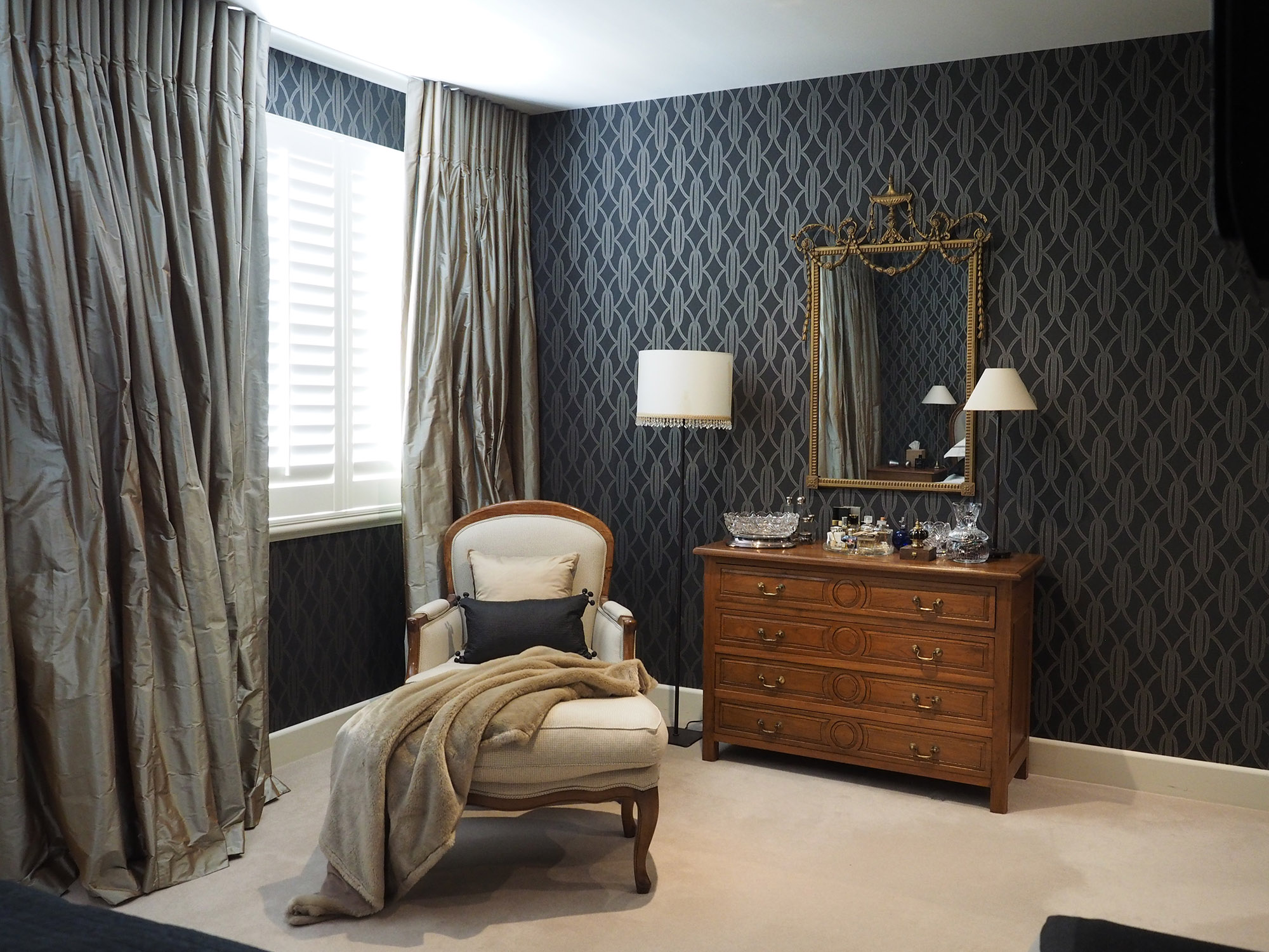
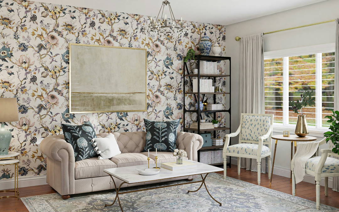
Choose one bold pattern to anchor the room, whether that is a statement wallpaper, a patterned rug, or a richly printed upholstered chair, and support it with plains and subtle textures in complementary tones. A vibrant Moroccan-inspired rug reads far more beautifully against a simple linen sofa and neutral walls than it does surrounded by equally busy competitors. The plain elements are not boring. They are the breathing space that makes the pattern sing. Armadillo has a strong range of patterned and textured rugs that work well as the anchor pattern in a living room or bedroom.
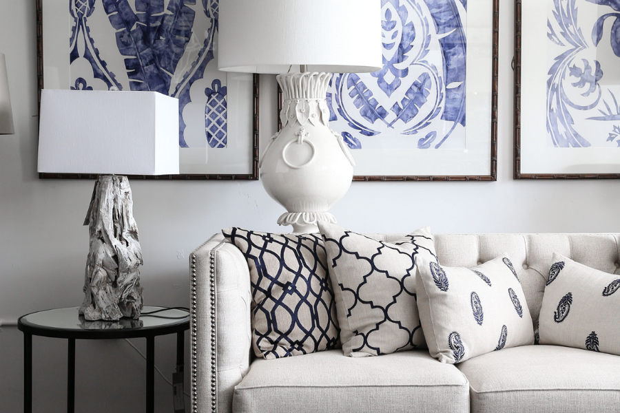
Matching is the enemy of interesting. A perfectly matched set of cushions, curtains, and upholstery in the same pattern signals a room that has been purchased rather than curated, and the result tends to look dated rather than considered.
Instead of matching, look for harmony. Two patterns can live happily together in the same room if they share a colour, a scale relationship, or a mood. A large-scale floral and a small geometric in complementary tones work because the scale contrast creates visual interest rather than competition. A tribal print and a simple stripe in the same colour family work because the mood is consistent even though the patterns are different. The rule is not to avoid pattern on pattern. It is to ensure that one pattern leads and the others support.
This is the most practical tip in this list and the one most often skipped. Patterns look different at sample size than they do at scale. A wallpaper that feels bold and exciting as a small swatch can feel overwhelming when it covers an entire wall, and a fabric that looked perfect in the showroom can read completely differently in your home's specific light conditions.
Order the largest sample available before committing to any significant pattern purchase. Pin wallpaper samples to the wall and live with them for a few days, observing how they look in morning light, afternoon light, and artificial light in the evening. Drape fabric samples over the furniture they will eventually cover. The small investment in samples almost always prevents a much larger and more expensive mistake. Luxaflex and most quality fabric suppliers offer generous sample programmes specifically for this reason.
The instinct to keep pattern small and restrained in a small room is understandable but often wrong. A bold pattern in a small space can make the room feel more dramatic and intentional rather than cramped, provided it is used with confidence rather than hesitation.
A small bathroom with a striking geometric tile, a compact hallway with a richly patterned wallpaper, or a cosy reading nook with a deeply textured fabric all benefit from the commitment to pattern rather than the compromise away from it. The key is to let the pattern be the clear design decision in the space and keep everything else simple and supportive around it. Trying to introduce a bold pattern timidly, one small cushion at a time, rarely produces the effect you are hoping for. Commit to it and the room will reward you.
Pattern and print require a little more consideration than plain surfaces, but the result, a room that feels layered, personal, and visually alive, is worth the workshopping. The principles are straightforward once you understand them: one anchor pattern supported by calmer companions, harmony rather than matching, samples before commitment, and the confidence to go bold when the room calls for it.
If you would like help selecting and combining prints and patterns for your home, get in touch. It is one of the more creative and enjoyable parts of the styling process.


