

The retail stores that people seek out, photograph, and return to are not simply well-stocked shops. They are complete environments, spaces with a specific identity and atmosphere that makes the experience of being in them as memorable as the products they sell. The design decisions behind these spaces are worth understanding not just for their commercial application but for the principles they illustrate about how any interior can be made genuinely worth entering.
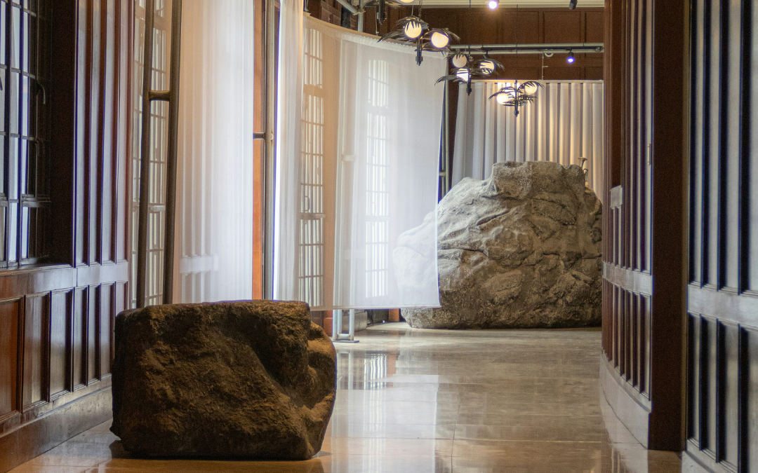
The most ambitious retail interiors position themselves not as shops but as cultural destinations. A store that incorporates tens of thousands of books alongside its product range becomes a library as much as a retail space. A heritage townhouse converted into a multi-floor shopping environment becomes a museum of the brand as much as a place to make purchases. A 19th century department store with a crystal-like glass roof becomes a civic landmark as much as a commercial enterprise.
This positioning as a cultural institution requires a genuine investment in the space beyond its commercial function. The books are not props. The heritage architecture is not a backdrop. They are substantive elements of the experience that give visitors a reason to be there beyond the transaction.
In residential design, the principle of treating a home as a cultural institution, a space that reflects and celebrates the specific cultural interests of the people who live in it, produces interiors with the same quality of genuine identity. A reading room that takes books seriously. A kitchen that takes food seriously. A music room that takes sound seriously. These spaces communicate that their occupants value something specific and have designed a home around those values.
A small retail space does not need to feel limited. Some of the most memorable store interiors are compact spaces that deliver a theatrical quality of ambience disproportionate to their footprint. Sapphire-toned upholstery, gem-encrusted decorative details, and cabinet displays organised around specific thematic worlds, under the sea, Russian royalty, botanical exploration, create a jewel-box quality that makes a small space feel like a destination rather than a constraint.
The principle is that intensity of design concept can compensate for limitation of scale. A small space designed with complete commitment to a specific atmosphere and aesthetic is more memorable and more compelling than a large space designed without a clear identity.
In residential design, this principle applies directly to compact rooms and awkward spaces. A bathroom designed with complete commitment to a single material and mood. A study alcove fitted out with genuine care and quality. A bar nook lacquered in a deep colour and properly lit. These spaces deliver impact disproportionate to their size because someone made genuine design decisions for them rather than treating them as afterthoughts.
One of the most counterintuitive but effective retail design decisions is the choice not to have window displays. A store that offers no glimpse inside from the street creates a sense of privacy and exclusivity that draws a specific kind of customer. The curiosity generated by what is concealed can be more powerful than the attraction of what is displayed.
This principle is an expression of a broader design idea: that restraint can be more powerful than abundance. The decision not to show everything, to keep something in reserve, to make the visitor work slightly to discover the full experience, creates an anticipation that pays off once the threshold is crossed.
In residential design, this translates into the principle of designed reveals. A garden that cannot be fully seen from the street. A kitchen that opens unexpectedly from a narrow hallway. A dramatic room that is glimpsed rather than displayed from the entrance. These moments of partial concealment and reveal create the spatial drama that makes a home feel like it has more to offer than first appearances suggest.
In a multi-level retail store, the staircase is one of the most powerful design elements available. It is the element that connects the floors, guides the visitor through the space, and creates the opportunity for a dramatic vertical gesture that nothing on a single floor can replicate.
A staircase with a chandelier that descends its full height, a sculptural form that makes the stairwell itself worth visiting, or a material finish that contrasts with the surrounding spaces all transform what might otherwise be a purely functional circulation element into the spatial centrepiece of the entire store.
In residential design, the staircase is one of the most consistently underinvested elements in the home. A staircase that is designed with genuine care, in quality materials, with considered lighting and a handrail that is worth touching, transforms the experience of moving through a home in a way that no amount of furniture or decoration can replicate. If the home has a double-height entrance or stairwell, a pendant or chandelier that engages with that vertical volume is one of the highest-impact design decisions available in the entire property.
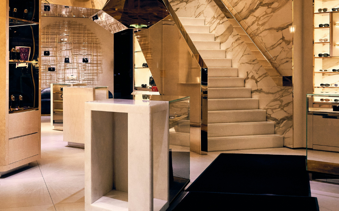
The retail interiors that feel most cohesive across multiple floors or rooms are almost always the ones where a single dominant material or surface treatment provides a continuous visual thread through the entire space. White Carrara marble used consistently across floors, walls, and countertops in a multi-level store creates a unified visual language that makes the space feel like a single designed object rather than a series of rooms connected by staircases.
This principle of material continuity is one of the most reliable tools available in any multi-room or multi-level interior. A material chosen as the foundation of the space and applied consistently across its key surfaces provides the visual coherence that allows other elements, furniture, lighting, artwork, to vary without the space feeling disjointed.
In residential design, this applies particularly to open plan homes and to properties where a renovation is being carried out room by room over time. Choosing a consistent flooring material, a consistent tile format in wet areas, or a consistent hardware finish throughout the home creates the thread that makes individually designed rooms feel like a unified interior. Beaumont Tiles is a useful reference for selecting a consistent tile or stone format that can carry through multiple rooms and surfaces in a renovation.
One of the most sophisticated retail design decisions is the choice of a display system that is almost invisible, made from transparent materials like lucite or glass, so that the products on display become the sole visual event in the room. When the shelving, the furniture, and the display fittings are transparent, the colours, forms, and textures of the products themselves create the visual interest of the space. The store becomes a gallery for the product rather than a room that competes with it.
This principle translates into residential design as the idea of the edited, minimally furnished room where the objects on display are genuinely worth seeing. A bookshelf with considered lighting where the books themselves create the visual interest. A kitchen with open shelving where the quality of the crockery and glassware becomes the decorative element. A bathroom vanity where a curated selection of quality products is displayed openly rather than concealed behind closed doors.
The transparency or minimalism of the display system only works when the objects being displayed are genuinely worth seeing. This is the discipline that the principle demands: edit ruthlessly, display only what deserves to be seen, and let those objects do the work.
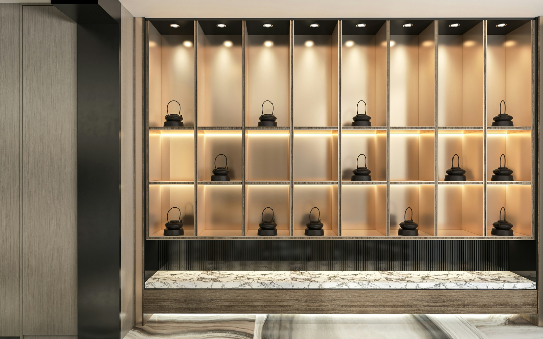
One of the most interesting retail design concepts is the idea of treating colour as a neutral rather than as a statement or a background. A store with muted pink walls and transparent lucite shelving uses colour not as a strong visual declaration but as a pervasive, ambient quality that sets a mood without competing with the products it displays. The colour is everywhere and therefore nowhere: it becomes the air of the room rather than a feature within it.
This is a sophisticated and somewhat counterintuitive approach to colour that produces spaces with a specific, quiet warmth that more conventional neutral palettes cannot achieve. The muted pink is warmer and more personal than white or grey while being sufficiently restrained not to compete with the products it surrounds.
In residential design, this principle suggests using colour at a lower saturation than instinct might dictate. A room that is entirely in a muted, dusty rose, a soft sage, or a warm off-white has a quality of colour warmth that a room with stronger colour accents against a neutral background does not achieve. The colour is present everywhere, informing the whole experience of the room, without being assertive at any specific point.
The retail interiors that endure in memory and that attract visitors regardless of whether they intend to buy anything are the ones where someone made genuine design decisions about what the space should be, beyond what it should sell. A cultural institution. A theatrical jewel box. A gallery for product. A single material carried through every surface. A staircase worth descending slowly.
These decisions are all expressions of the same underlying commitment: to create a space that is worth being in for its own sake. That commitment, applied to any interior at any scale, is what produces spaces that people genuinely remember.
If you would like help bringing this level of design intention to a commercial fit-out or a residential project, get in touch. It is the kind of thinking we bring to every project we work on.


