

Colour is one of the most personal decisions in interior design and one of the most commonly avoided. Most people default to white or a safe greige and leave it at that, not because they do not want colour in their homes, but because they are not sure how to choose it without committing to something they will regret.
The good news is that choosing a colour palette is far more manageable when you understand a few basic principles. A well-chosen palette does not need to be complicated. In fact, the simpler and more considered it is, the better it works.
The most common mistake when approaching colour for a home is trying to solve the whole house at once. The result is either paralysis or a series of disconnected decisions that leave each room feeling unrelated to the ones around it.
Start with the room you spend the most time in, or the room that bothers you most. Get that room right first. Once you have a palette that works in one space, it becomes far easier to extend it through the rest of the home with variations rather than starting from scratch in each room.
Every cohesive colour palette has three components working together, and understanding what each one does makes the whole process easier.
The base colour covers the majority of the room, usually the walls and the largest pieces of furniture. It sets the overall tone and temperature of the space. In most Australian homes the base colour is a neutral, but neutral does not mean cold or colourless. Warm whites, soft greiges, sandy taupes, and muted clay tones all count as neutrals and create very different feelings in a room depending on their undertone.
The secondary colour appears in mid-sized elements: curtains, rugs, upholstered chairs, and bed linen. It supports the base without competing with it and adds depth and warmth that a single-colour room lacks.
The accent colour appears in small but deliberate moments: cushions, ceramics, artwork, and accessories. It is the colour that gives the room personality and that you can change relatively easily as your taste evolves.
A palette built on this structure does not need to be complex. Three colours used well across these three tiers will always look more considered than eight colours used without a clear logic.
Every colour has an undertone, a secondary hue that influences how it reads in different lights and how it relates to other colours in the room. White paint is a good example: some whites are warm (with yellow, pink, or red undertones) and some are cool (with blue or green undertones). The difference between them in a room is significant.
Before choosing any paint colour, identify whether you want your palette to sit in a warm register or a cool one. Warm palettes, built on yellows, ochres, reds, and earthy browns, tend to feel cosy, welcoming, and grounded. Cool palettes, built on blues, greens, greys, and soft whites with blue undertones, tend to feel calm, airy, and contemporary.
Mixing warm and cool undertones in the same room is where most colour problems originate. A warm timber floor with cool grey walls can work beautifully when the grey has a warm undertone, and look uncomfortable when it has a cool one. Dulux offers a colour consultation tool online and in-store that helps identify undertones and find colours that sit harmoniously together, which is worth using before committing to any paint.
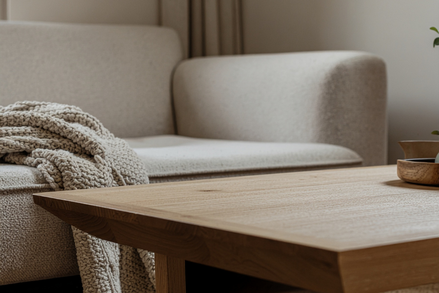
The 60-30-10 rule is one of the most reliable frameworks for distributing colour in a room. It works as follows: 60 percent of the room in the base colour, 30 percent in the secondary colour, and 10 percent in the accent colour.
In practice this means walls and major furniture in the base colour, curtains, rugs, and secondary upholstery in the supporting colour, and cushions, art, plants, and accessories in the accent. The proportions ensure that no single colour overwhelms the space and that there is enough of each colour to register as a deliberate choice rather than an accident.
You do not need to follow this rule rigidly. It is a starting point, not a formula. But when a room feels off and you cannot identify why, checking whether the colour proportions are roughly in balance is often the quickest way to diagnose the problem.
A cohesive home does not mean every room is the same colour. It means that the colours across different rooms share a relationship, a common undertone, a recurring accent, or a consistent level of saturation, that makes the home feel like a considered whole rather than a series of unconnected spaces.
One practical approach is to choose a palette of five or six colours and distribute them across the home in different roles. A colour that is the accent in the living room might become the secondary tone in a bedroom. The base colour in the hallway might shift to a slightly deeper version of the same tone in the dining room. These variations create the feeling of a home that has been designed with intention across all its spaces.
Connecting colours through repeated accents is particularly effective in open plan homes where rooms flow directly into each other. A deep blue that appears in a cushion in the living area, a ceramic in the dining space, and a throw in the adjacent study creates a thread that ties the spaces together without making them identical.
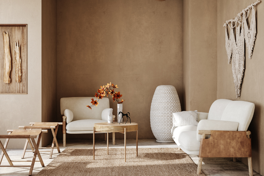
Painting walls is the most impactful way to introduce colour, but it is not the only one. If you are renting, working with a limited budget, or simply not ready to commit to a painted wall, colour can be introduced through layers that are easier to change.
Textiles are the most flexible and accessible starting point. A rug in a warm terracotta, cushions in a deep sage green, or curtains in a dusty blue introduce significant colour into a room without touching a single wall. The advantage of starting with textiles is that they are easy to swap as your taste evolves and they allow you to test a colour in your specific light conditions before committing to it on a larger surface.
Artwork is another highly effective colour tool. A single large-scale work with a strong colour palette can anchor an entire room and give you a ready-made source palette to pull from when choosing everything else. Furniture in a statement colour, a velvet armchair in burnt orange or a sideboard in deep green, introduces colour at a scale that reads as a design decision rather than an accessory choice.
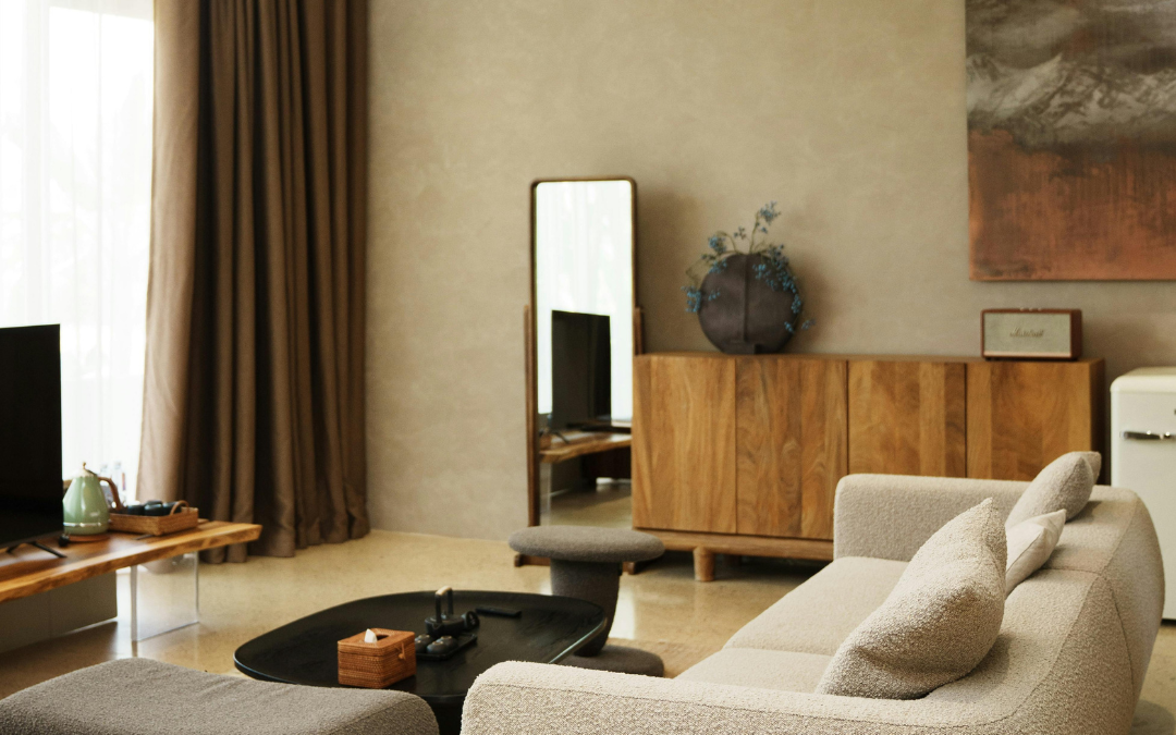
One of the most common misconceptions in interior design is that a neutral palette is a safe or uninteresting choice. The most beautiful neutral interiors are among the most sophisticated rooms in design, precisely because they require a deeper understanding of colour, texture, and light to work well.
The secret to a successful neutral palette is variation within the neutrals themselves. Warm white walls with a sandy linen sofa, a jute rug, raw timber shelving, and a terracotta ceramic vase are all technically neutrals, but together they create a room that is rich in warmth, texture, and visual interest. The colour is there. It is simply working at a quieter register.
If your neutral room feels flat or bland, the solution is almost always more texture and material contrast rather than more colour. A bouclé throw, a rattan chair, a polished concrete surface, or a rough-hewn timber piece all add the depth that makes a neutral palette feel considered rather than empty.
Colour looks different on a paint chart than it does on a wall. It looks different in morning light than in afternoon light. It looks different under artificial lighting in the evening. The only way to know how a colour will actually perform in your specific room is to test it in that room across different times of day.
Paint a large sample directly onto the wall rather than on a piece of card that you move around. A sample of at least A3 size gives you a much more accurate read than a small swatch. Live with it for several days before making a final decision. Dulux sample pots are available in most hardware stores and are one of the most cost-effective insurance policies available against an expensive mistake.
The same principle applies to fabric and upholstery samples. Order generously and test them in the room before committing. A fabric that looked perfect in a showroom can read completely differently in your home's particular light.
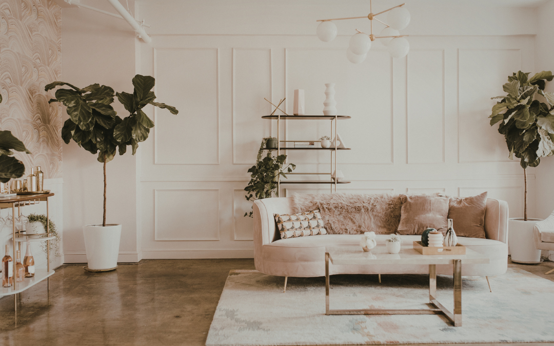
The best colour palettes are the ones you stop noticing after a while, not because they are boring, but because they feel so right for the space and the people who live in it that they simply become part of how the home feels. Getting to that point takes a little patience, some testing, and a willingness to trust your instincts once you have given them the right framework to work within.
If you would like help developing a colour palette for your home or are not sure where to start, get in touch. Colour is one of the most enjoyable parts of any design project and we would love to help you get it right.


